Download Intent
Designing Softonic's highest-performing ad format through Lean UX experimentation
Softonic is one of the largest software portals in the world with more than 100 million monthly visitors. In September 2018, the platform received inquiries from major clients seeking effective software distribution methods. These companies were prepared to invest substantially in advertising on Softonic's platform to expand their user base.
The Challenge
Softonic operates as one of the world's largest software portals, serving over 100 million monthly visitors. In late 2018, major clients sought effective software distribution channels through advertising investments aimed at user acquisition.
The platform's user journey is highly transactional. Users typically search via search engines, land on program pages organically, and complete downloads rapidly. Google often ranks secondary funnel pages higher than target program pages, shortening user interactions further. Users focus exclusively on obtaining desired software quickly, making cross-selling difficult. Previous ad placements on program or post-download pages showed poor performance. The initiative represented Softonic's first CPI (Cost Per Installation) browser-based campaign system since the company's 2014 downturn.
My Role
UX Engineer — Ideation, Prototyping, Design, Development & Refinement over one year. The team employed Agile methodologies with Lean principles. Later responsibilities included designing an internal CMS for sales team campaign management.
Ideation & Prototyping
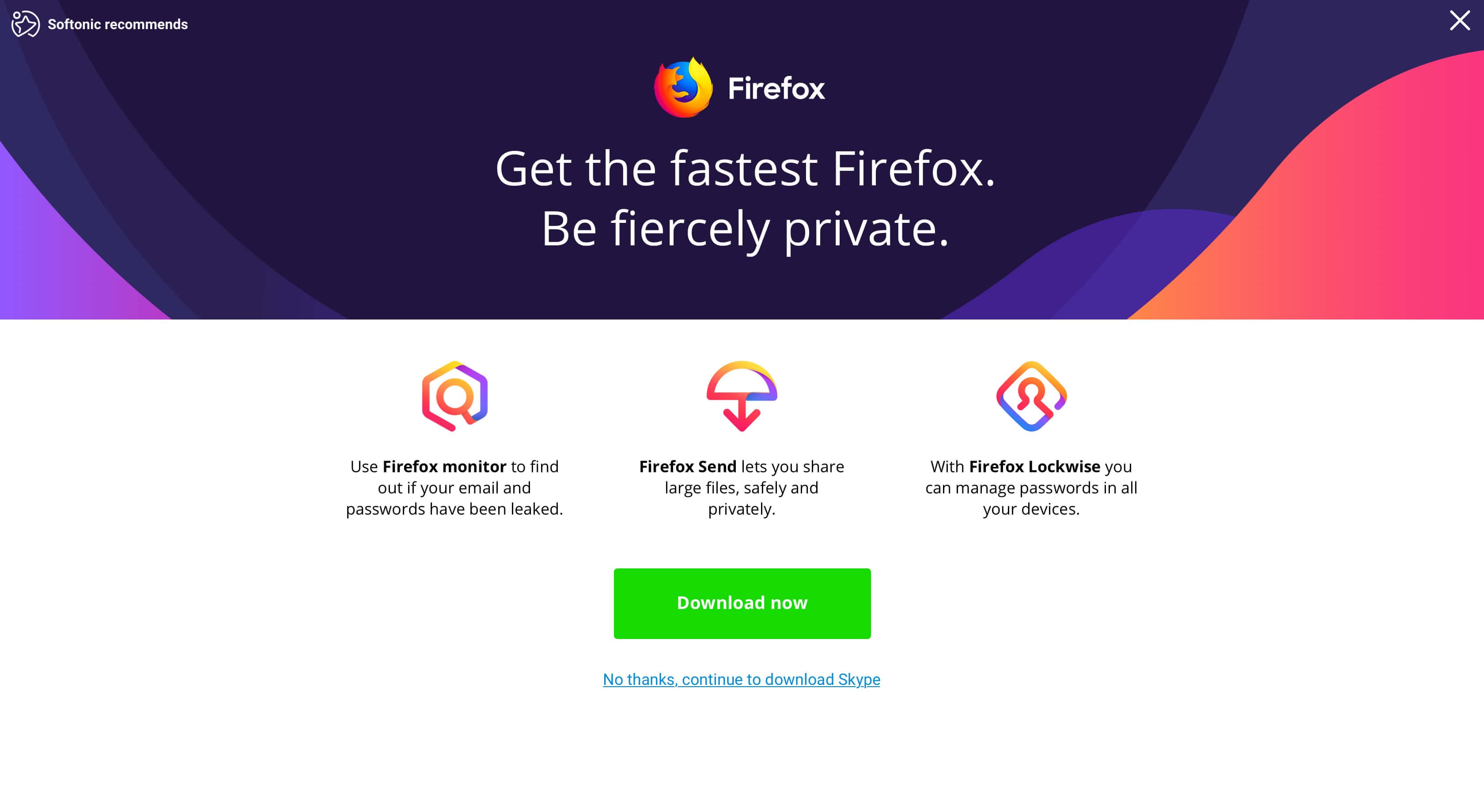
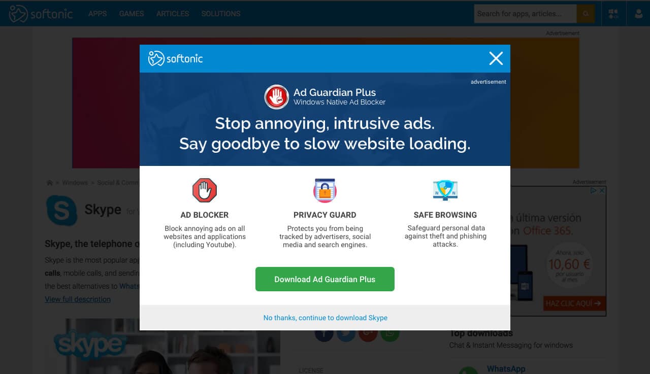
The team recognized they needed to interrupt the existing flow to capture attention. The optimal moment was pre-download, as engagement declined significantly afterward. Three approaches were prototyped:
Full-Screen Modals
Maximized attention and screen space for showcasing software benefits.
Half Screen Modals
Less aggressive approach with bottom-positioned slide-in, preserving background context.
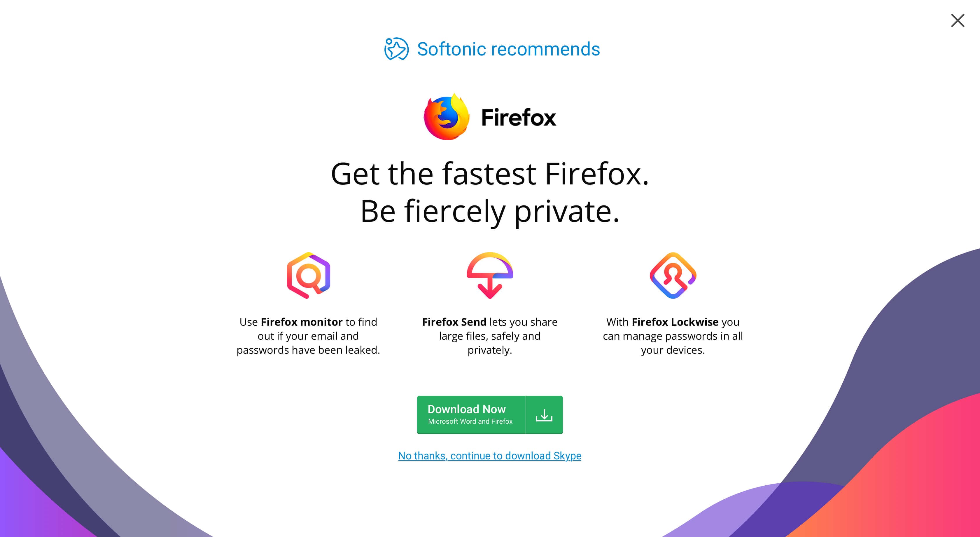
Regular Modals
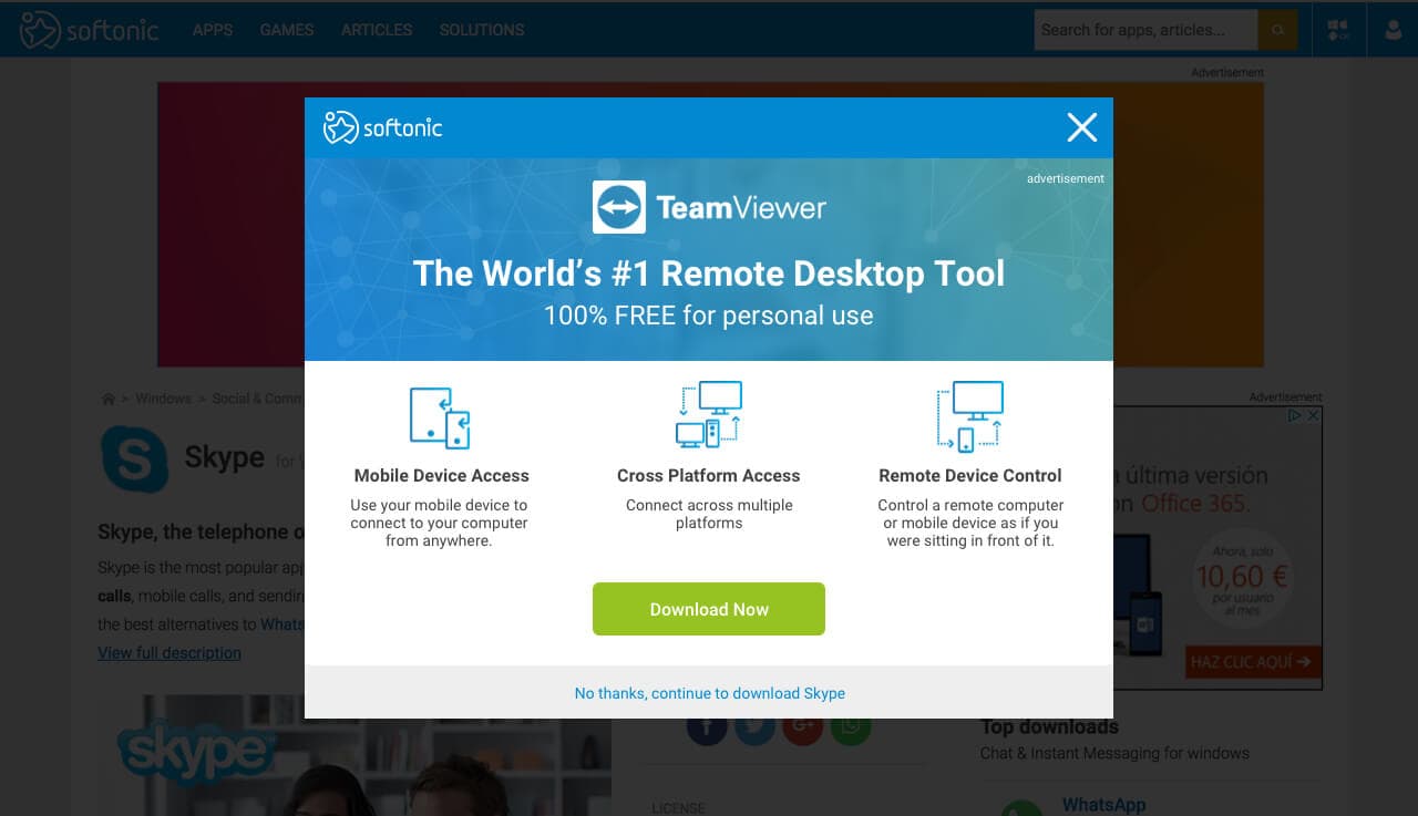
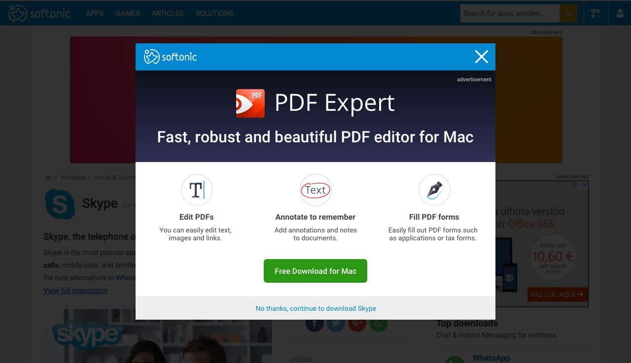
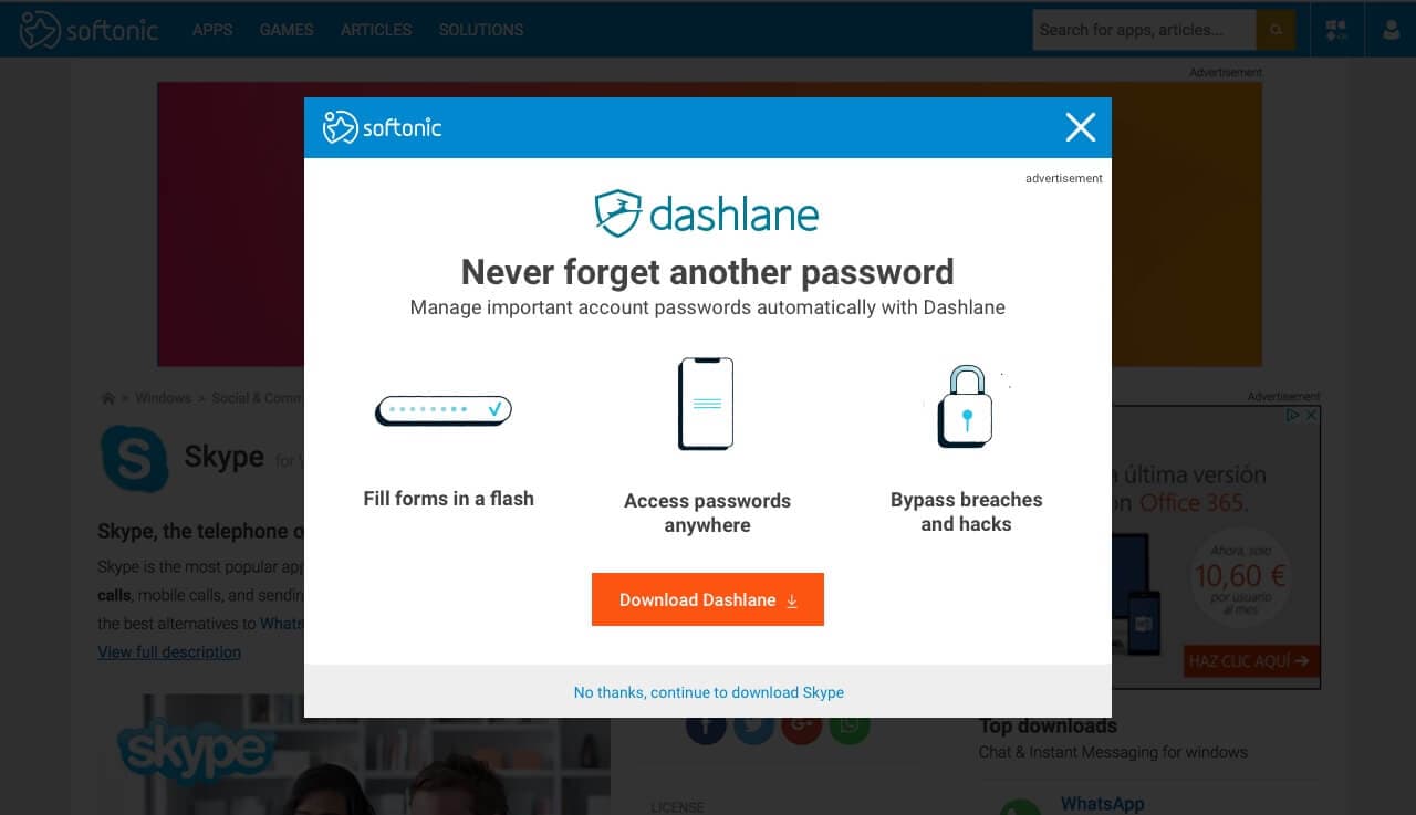
Classic format offering design/development flexibility while reducing experiment costs. This format was selected for initial testing due to faster development and lower costs.
Initial Testing Phase
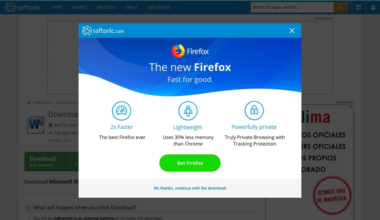
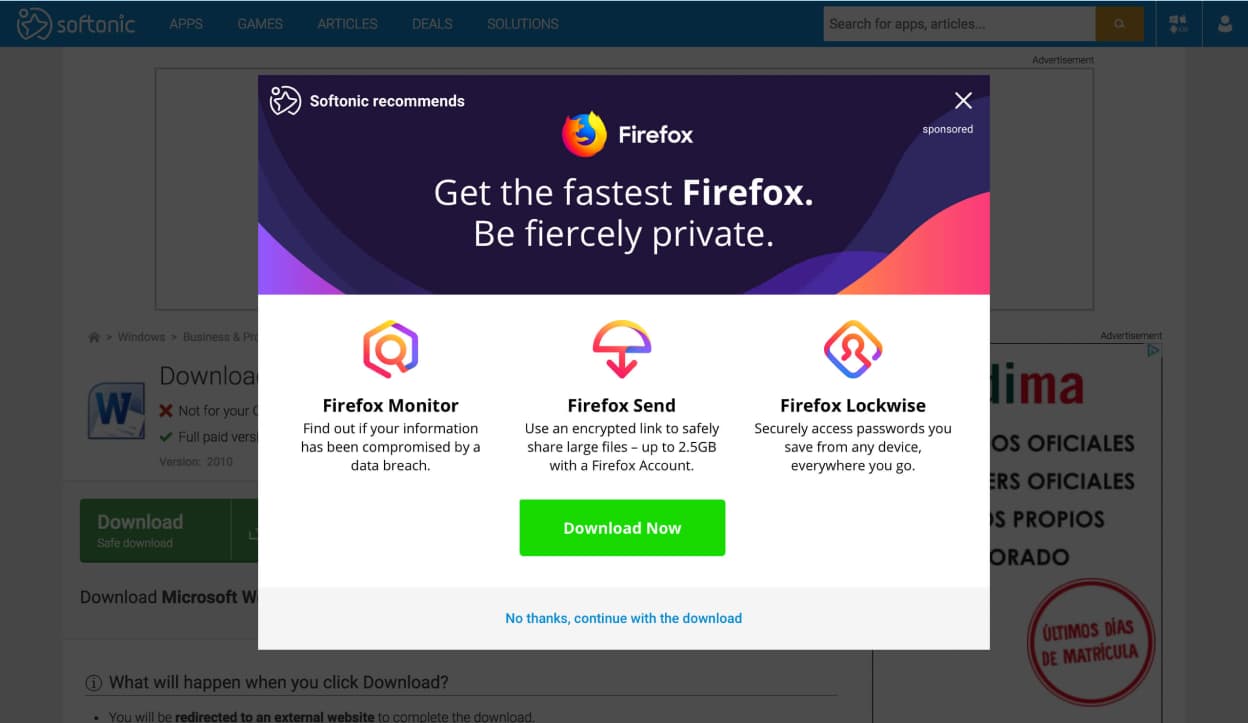
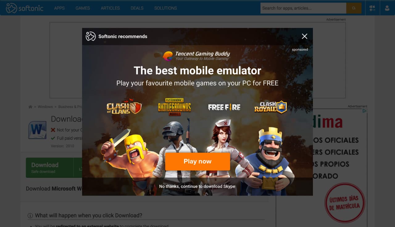
Designers created multiple variations testing message types, CTA copy, and color schemes. Hypotheses included clear, direct messaging with minimal distractions and strong value propositions, social proof through reputable source comments and user testimonials, and leveraging brand marketing materials to highlight software benefits.
The multivariate testing process involved gathering quantitative data from Softonic's massive traffic volume. Qualitative assessment included Hotjar session recordings and internal interviews.
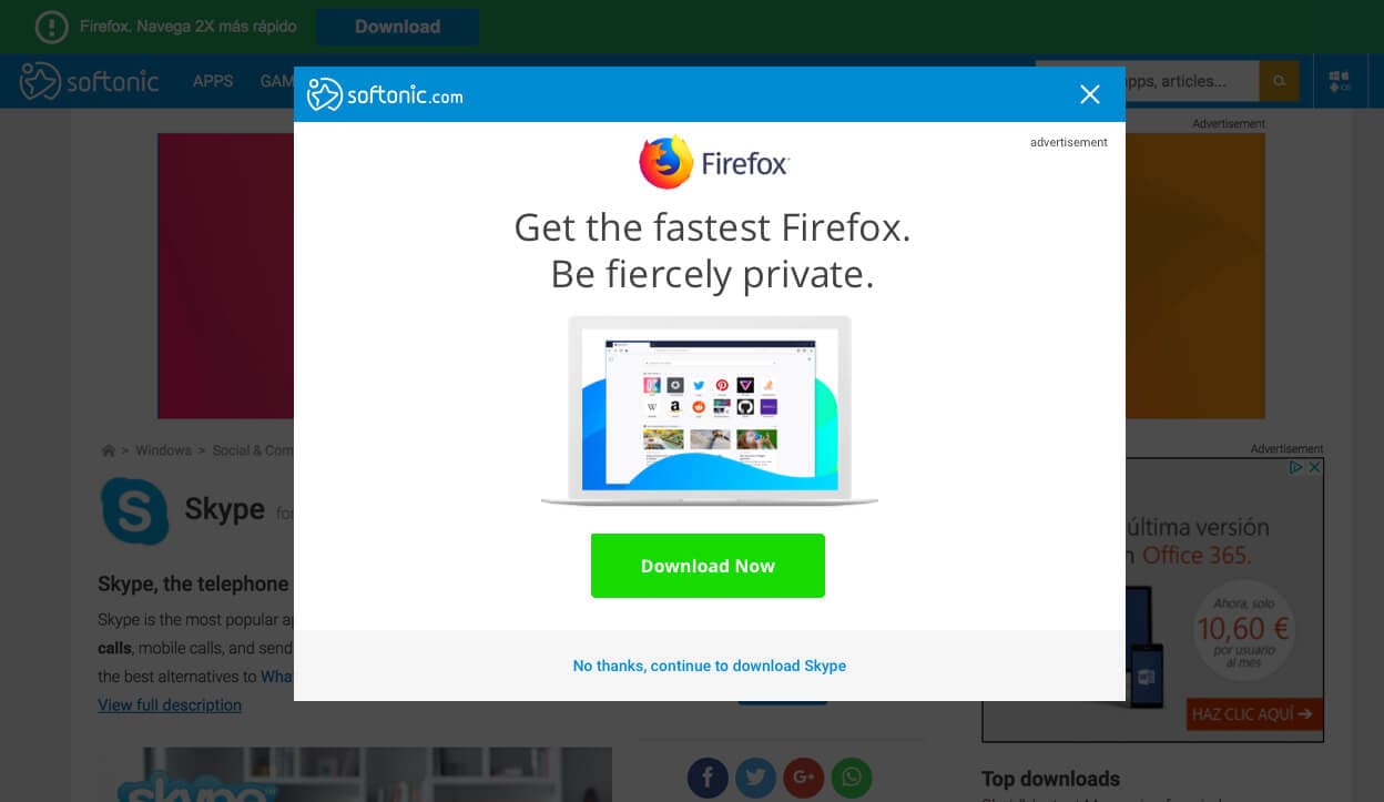
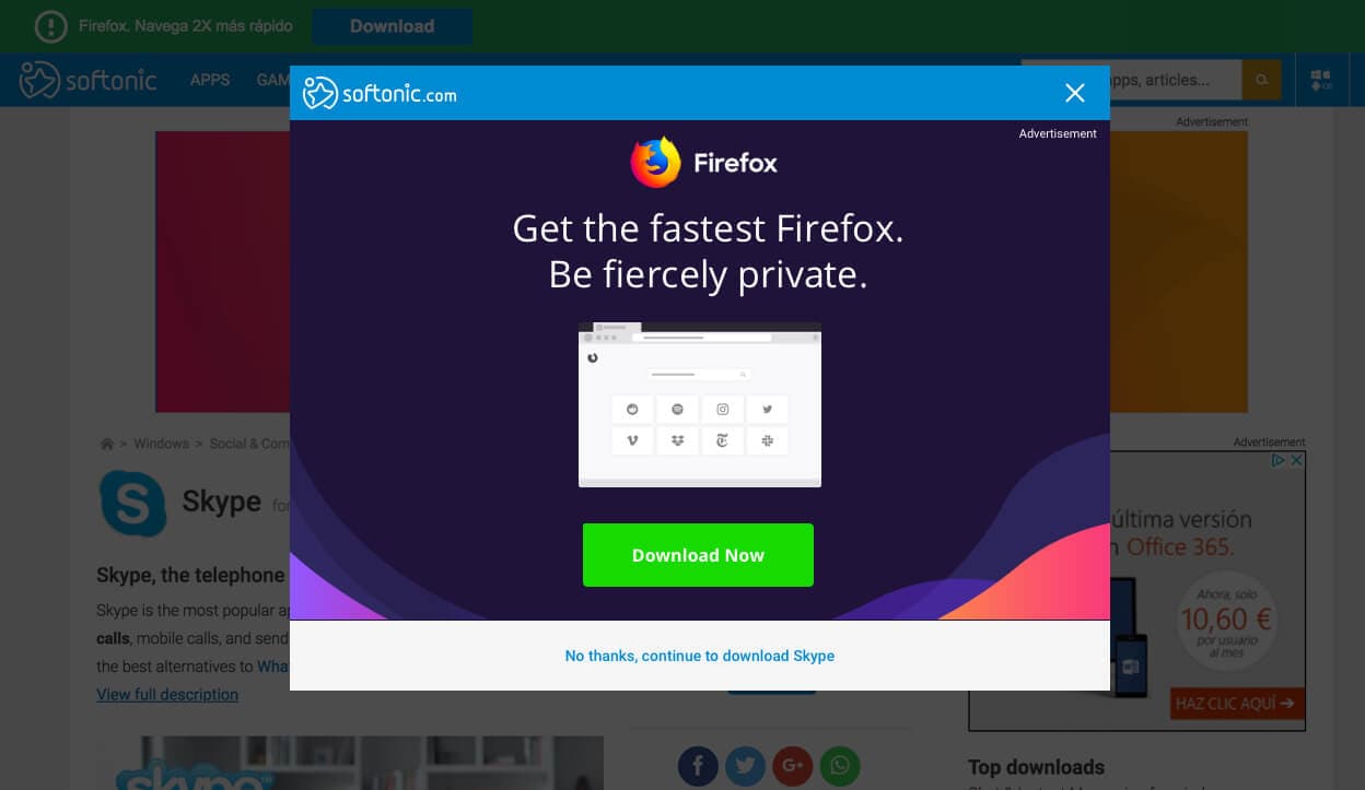
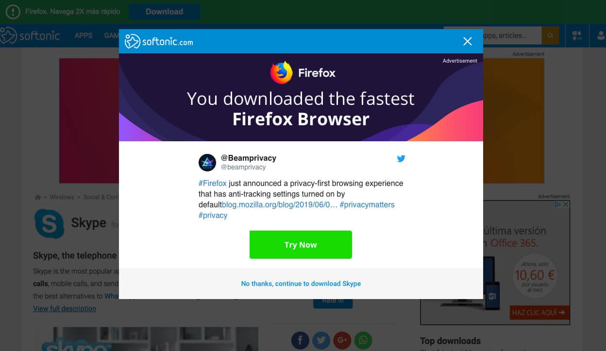
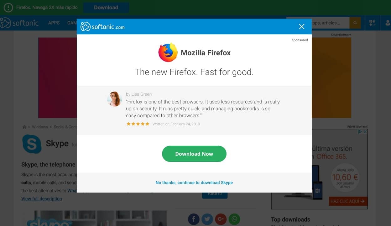
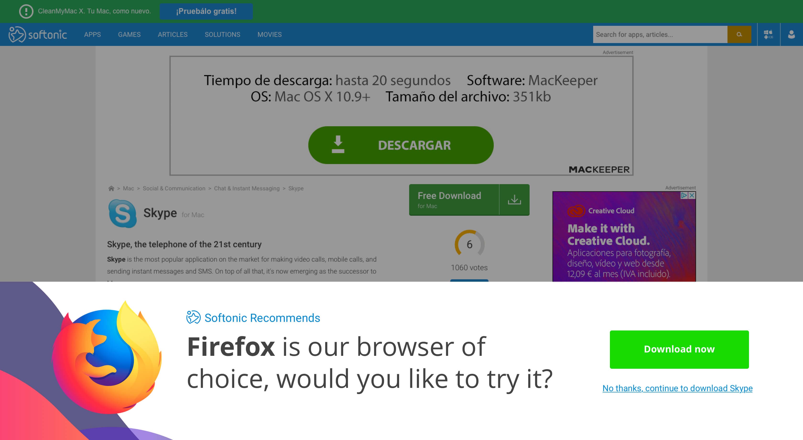
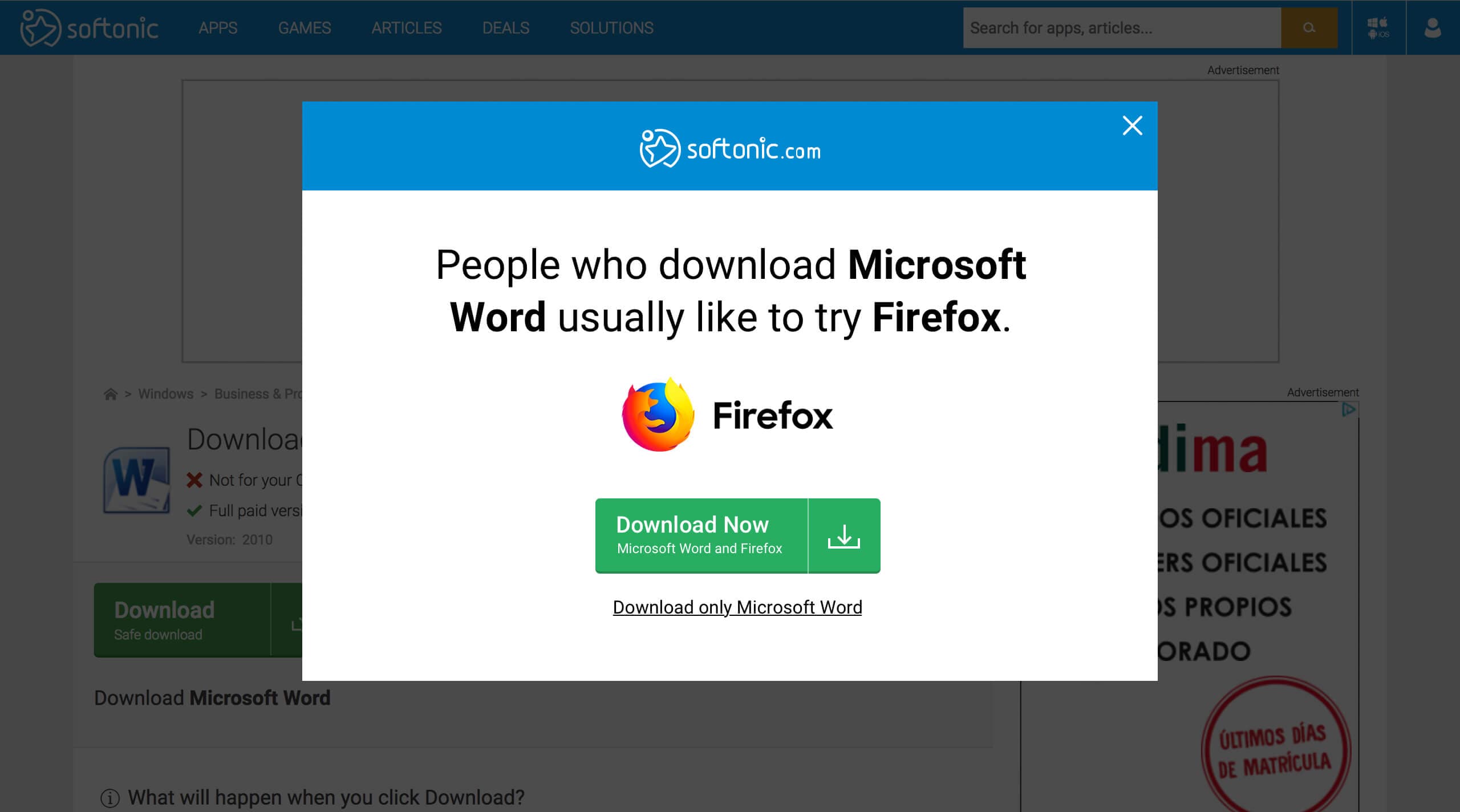
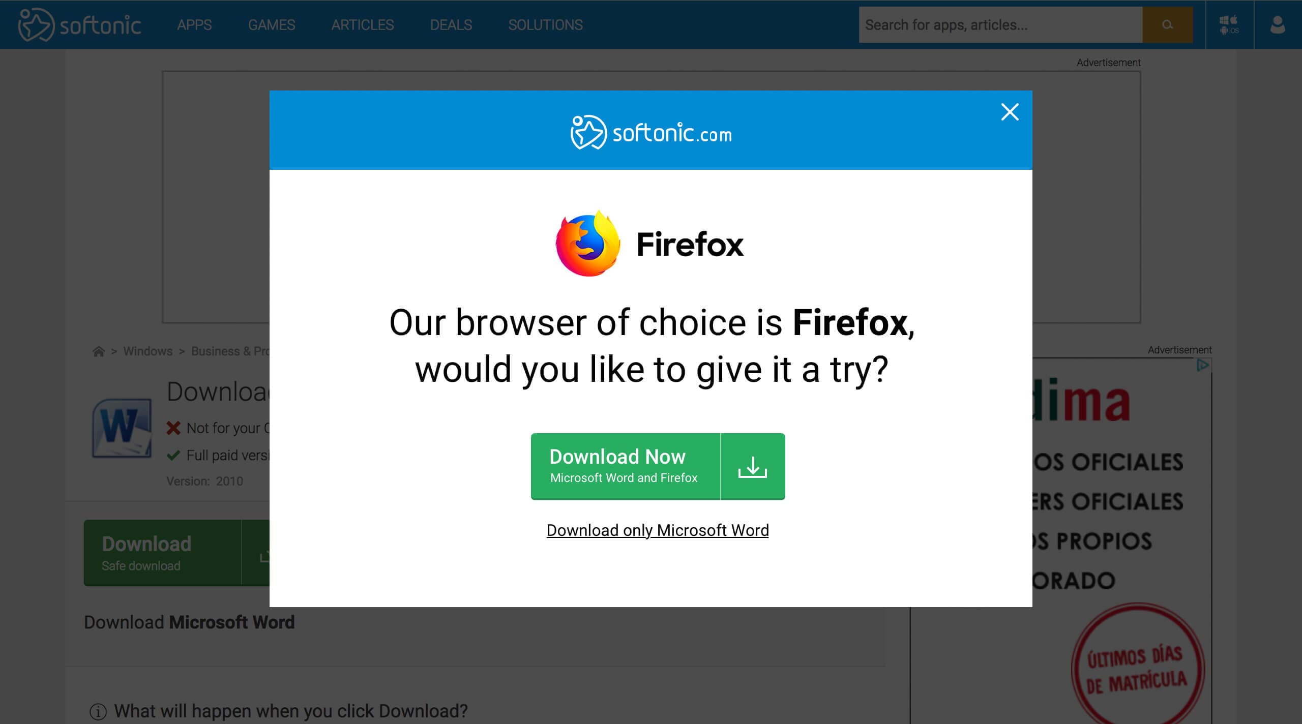
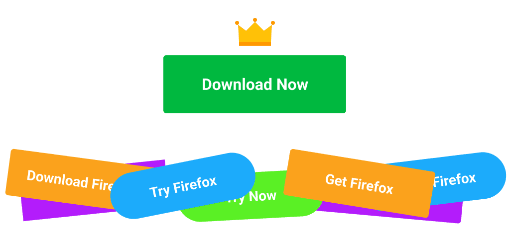
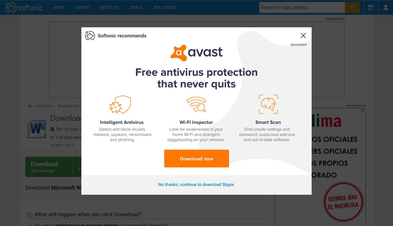
Dark Patterns
Testing revealed that CTA copy and button color produced the highest conversion impact. The phrase "Download Now" with green buttons (Softonic's brand color) generated 20-25% CTRs compared to alternative phrasings like "Try Now" or "Get Firefox" at 10-15%. Despite UX team concerns about long-term brand damage, leadership retained aggressive messaging because advertisers paid per installation, final download conversion remained strong, and CPI metrics justified the approach.
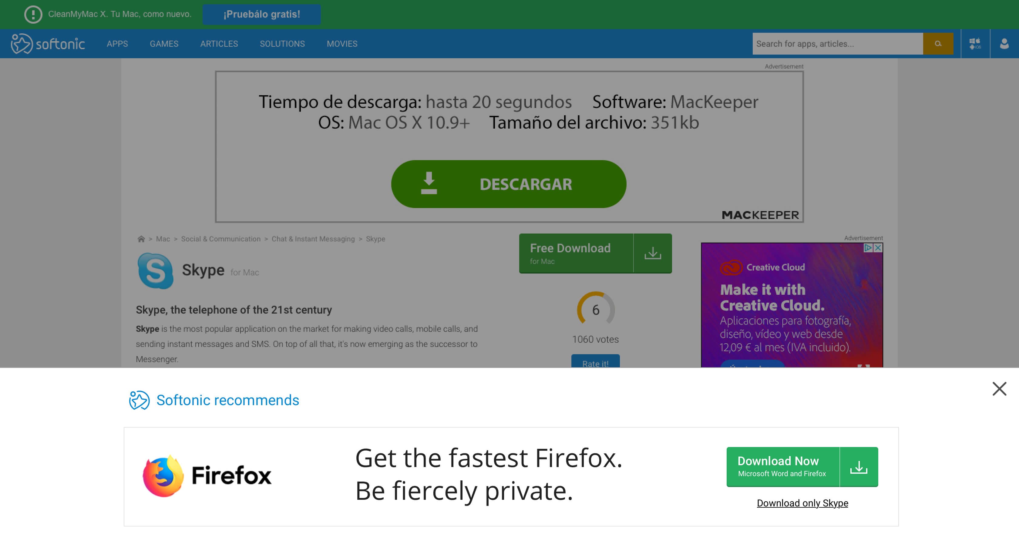
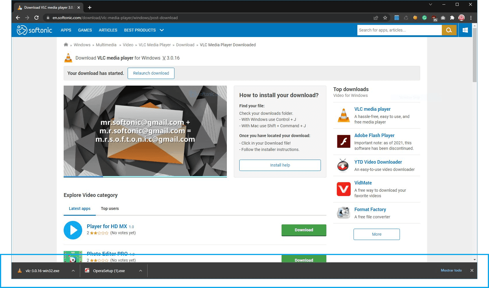
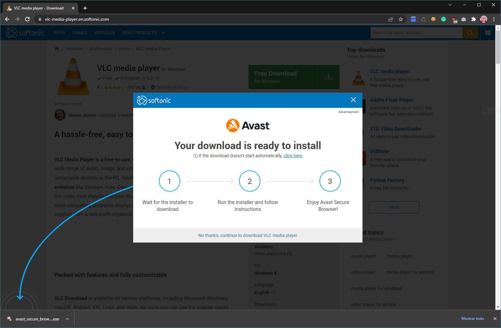
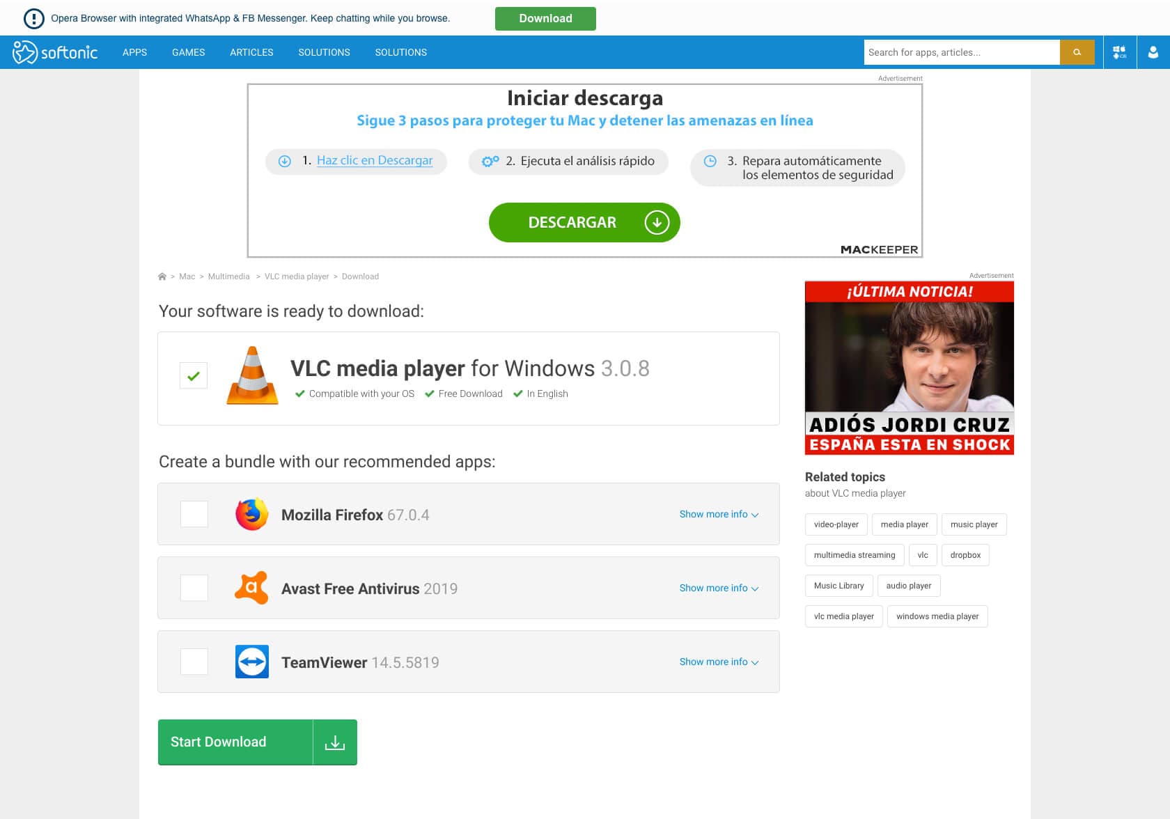
Installation Rate
While download CTRs were strong, installation rates proved disappointing — the actual metric advertisers paid for. Qualitative testing revealed users often ended with two installables simultaneously, creating confusion. An additional installation guidance screen was introduced, clearly displaying setup steps. This modification achieved immediate success with minimal iteration requirements.
Final Implementation
Within six months, the download intent placement became the website's highest-performing ad format and a major revenue stream. Personalized campaigns were developed for expanding client bases, with designs tailored to specific niches and audience demographics.
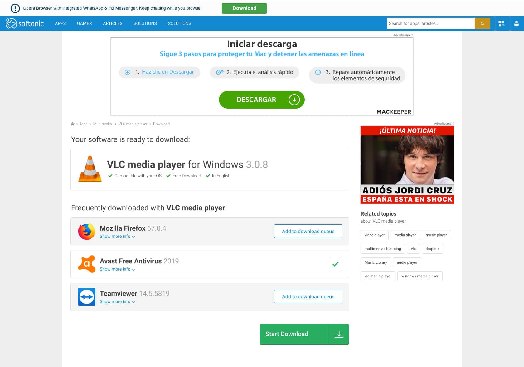
Alternative Tests
The Product Design Team explored less misleading approaches. Brainstorming sessions across departments resulted in a software bundle concept — similar to e-commerce add-to-cart functionality. Users could select additional software during downloads. Production testing via Hotjar revealed user confusion when the download button moved below the fold. Ironically, CTRs for ad-containing buttons skyrocketed despite usability issues.
Conclusions & Learnings
Key accomplishments included maintaining Lean principles throughout, rapid iteration cycles enabled by Softonic's user volume, and effective quantitative data gathering. The case highlighted the ethical tension between short-term business metrics and user experience design principles. While revenue impact was measurable and positive, the inability to authentically communicate software value to genuinely interested users created professional frustration.