Tokoro
Branding and product design for a place-sharing app

While working at Softonic, me and a couple of colleagues were always looking for good ideas to start our own venture on the side. At some point we came up with an idea that seemed appealing and I jumped straight to design a concept. This case study explains the process I went through.
The Idea
My colleagues and I shared a passion for food and frequently recommended places to each other around Barcelona and while traveling. We identified a problem: it's a bit annoying to read through reviews written by people that you don't know, may have different taste, could be fake or that are just not in your same line of thought.
The key insight: it's always easier to trust (or not trust) a friend's opinion.
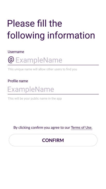
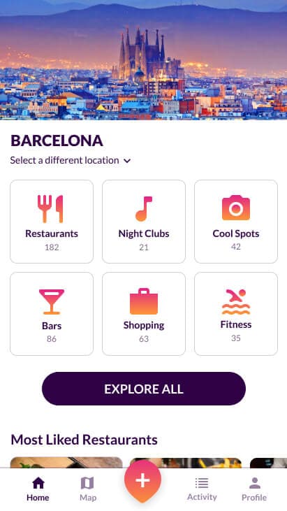
Goal: Create and privately share lists of favorite places.
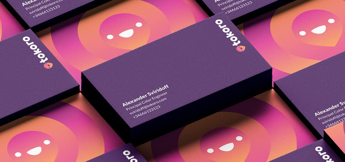
Branding
Working for mature companies it's very unlikely that you'll be asked to develop a brand from scratch, so this was an exciting opportunity.
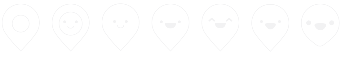
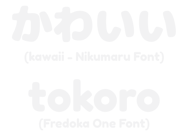
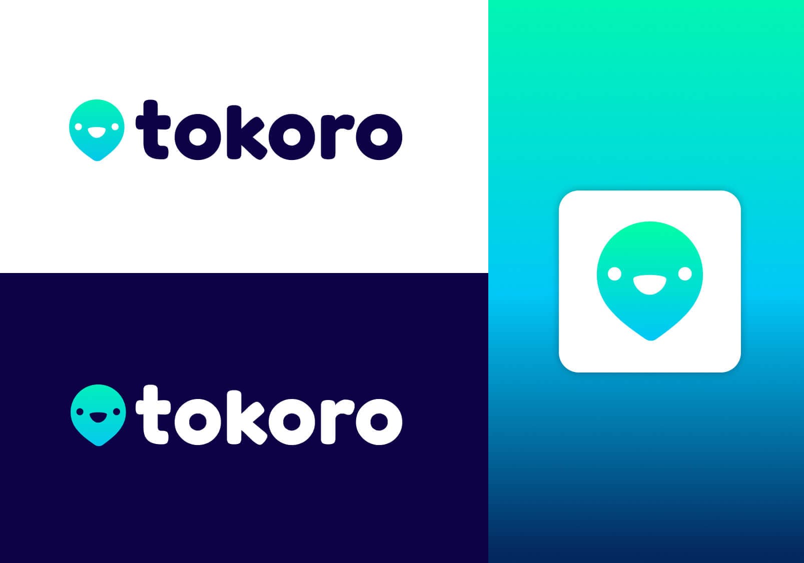
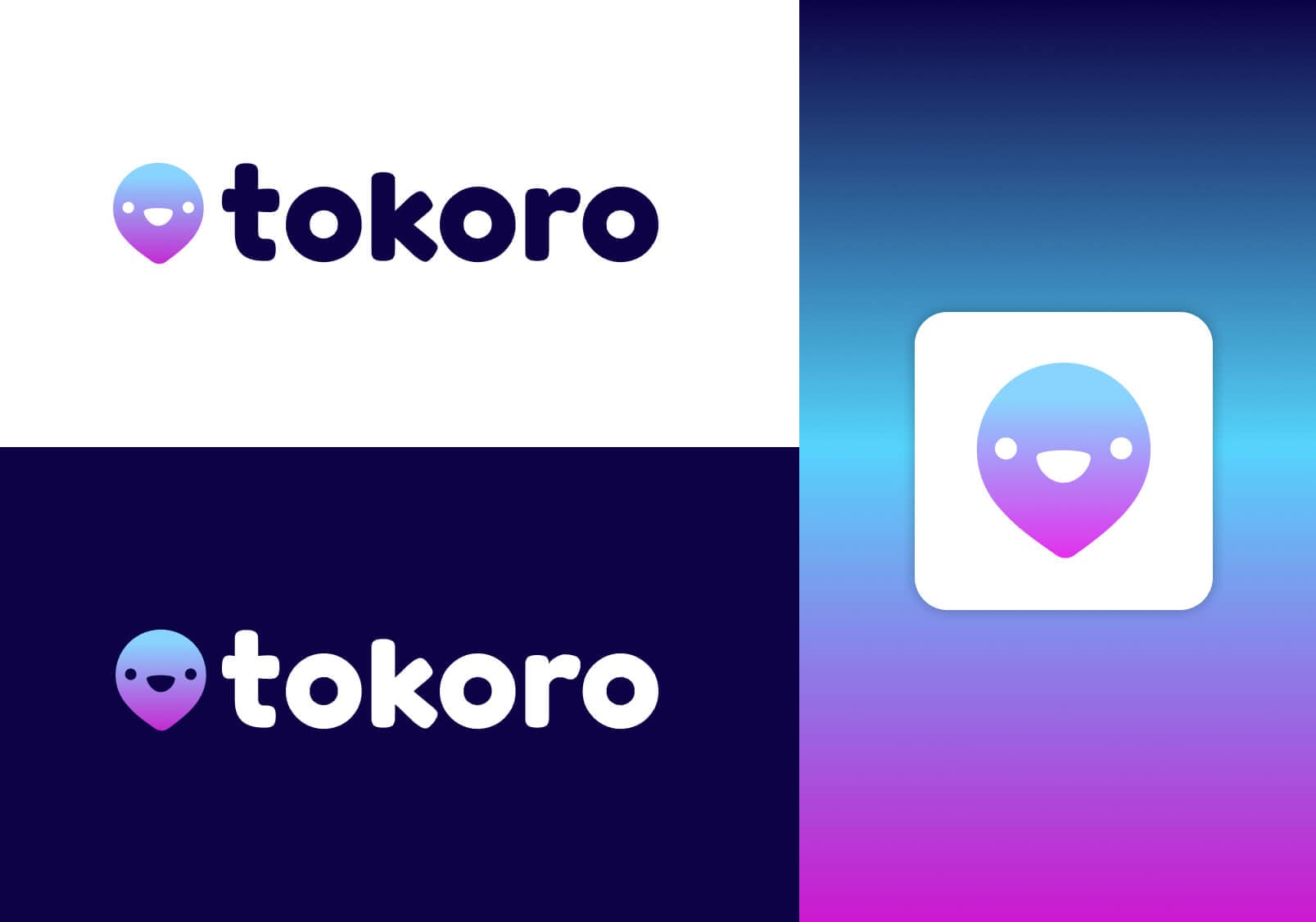
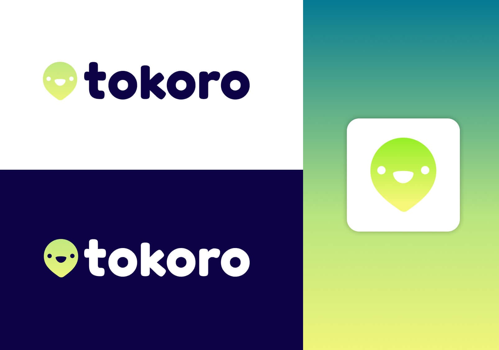
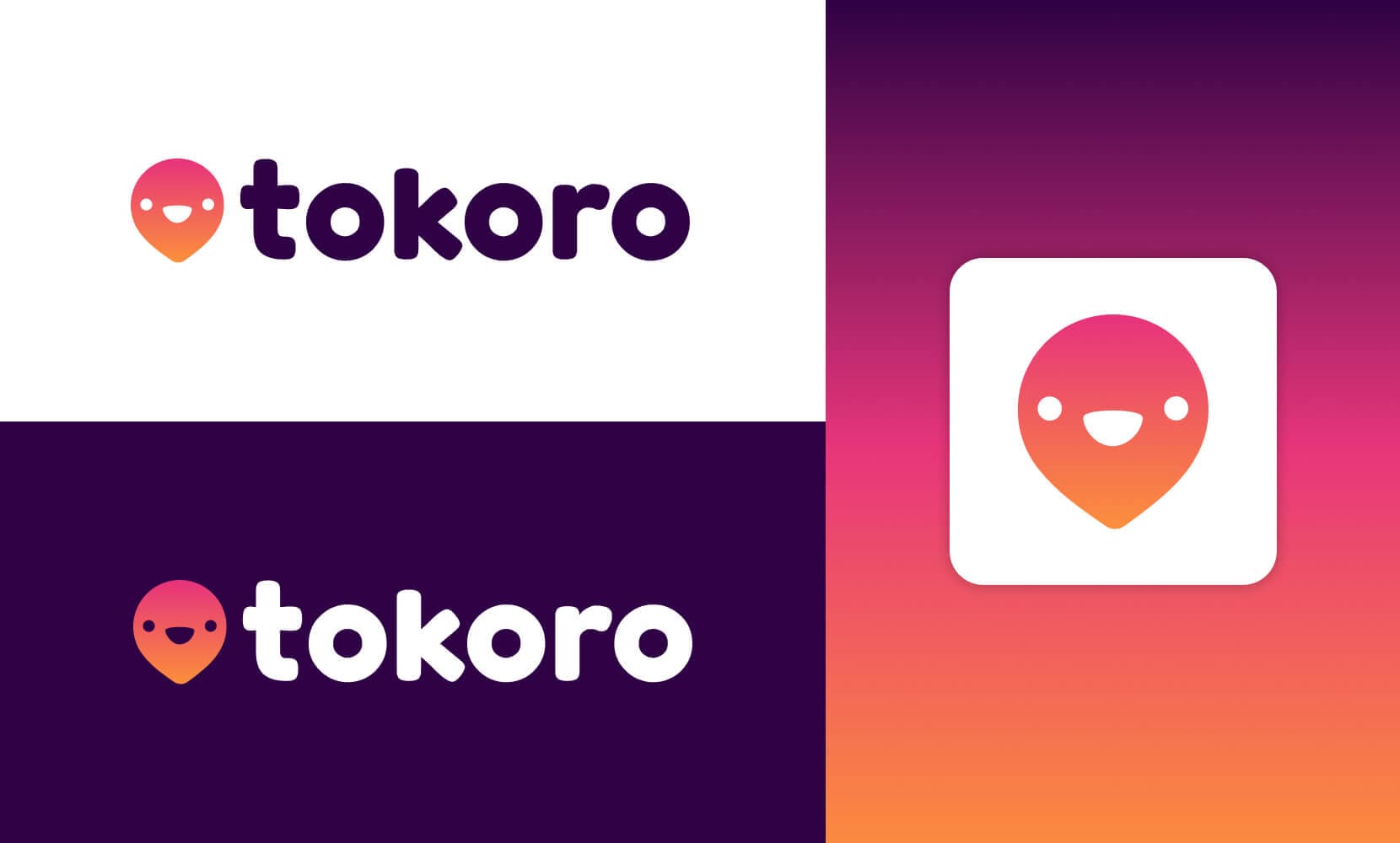
The word "tokoro" (ところ/所) means "a place, spot, scene or site" in Japanese. The logo design combines the classic map pin icon with kawaii elements from Japanese design aesthetics.

For typography we chose Fredoka One from Google Fonts — a rounded sans, legible and playful that reminisced to Japanese characters.
We created color scheme compositions and gathered feedback from friends.
Prototypes
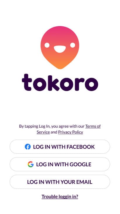
The approach was to practice design craft by building something nice, instead of focusing on the usability part. High-fidelity prototyping to build a coherent design system using hypothetical screens and interactions.
Inspiration sources: Mapstr, TripAdvisor, The Fork, Google Maps.
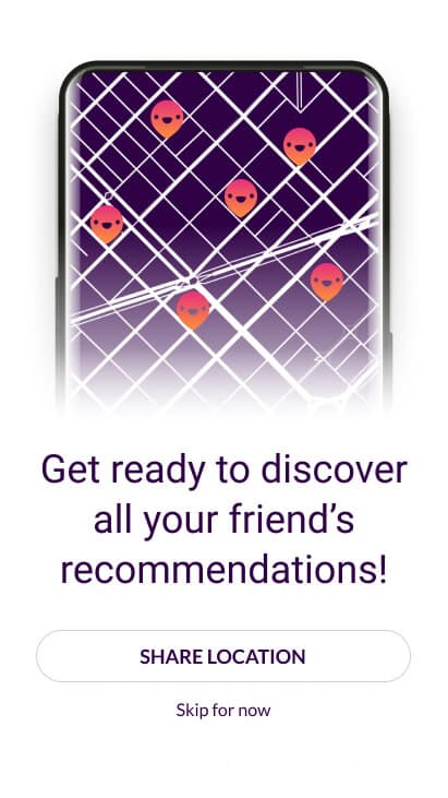
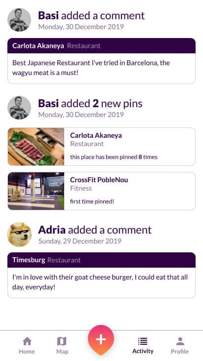
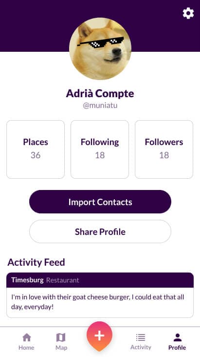
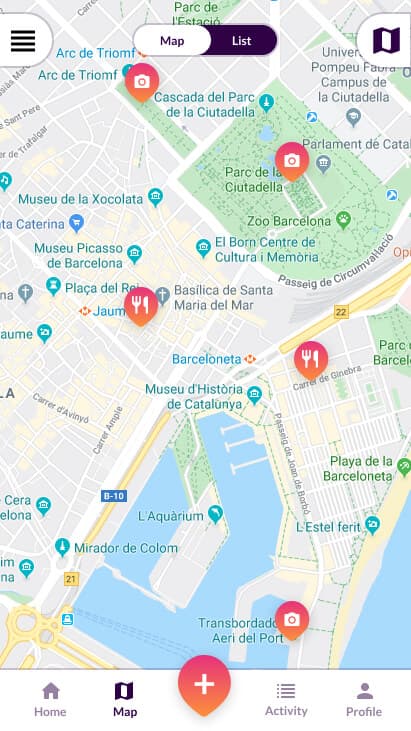
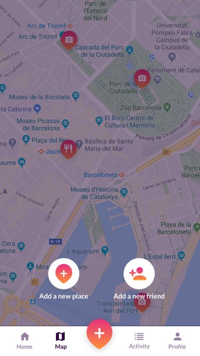
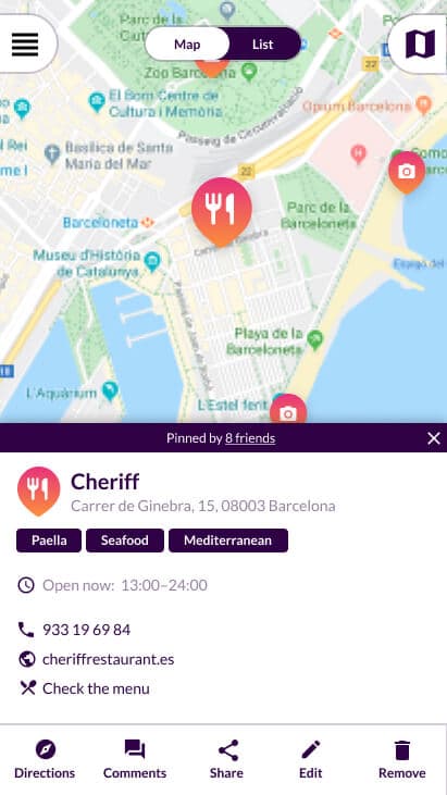
Screens designed: Onboarding, home, activity feed, profile, and map views.
Conclusions & Learnings
The team decided to stop pursuing the project despite completed designs. But the value was in the process — exercising your abilities and creativity through personal projects when corporate roles limit exploration.
The project allowed experimentation with gradients and bold color palettes, portfolio development on Dribbble, and exploring print design.